Color Helper
Play around with colors
Color Helper, nice to meet you
What is it, and who is it for?
The Color Helper helps CCA graphic design students collect the color palettes that they see in daily life, and explore their possibilities of them. Users are able to learn the color theory and their relation on the wheel, and explore how colors interact, such as gradients, patterns, blurriness, smudginess and other abstract looks. They can also see how those colors overlap. Through the Color Helper, students can get inspiration and provoke the idea of their own work.
Feature Walkthrough
A handy color database in your pocket
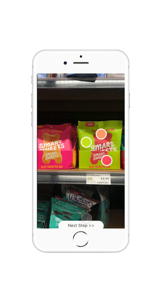
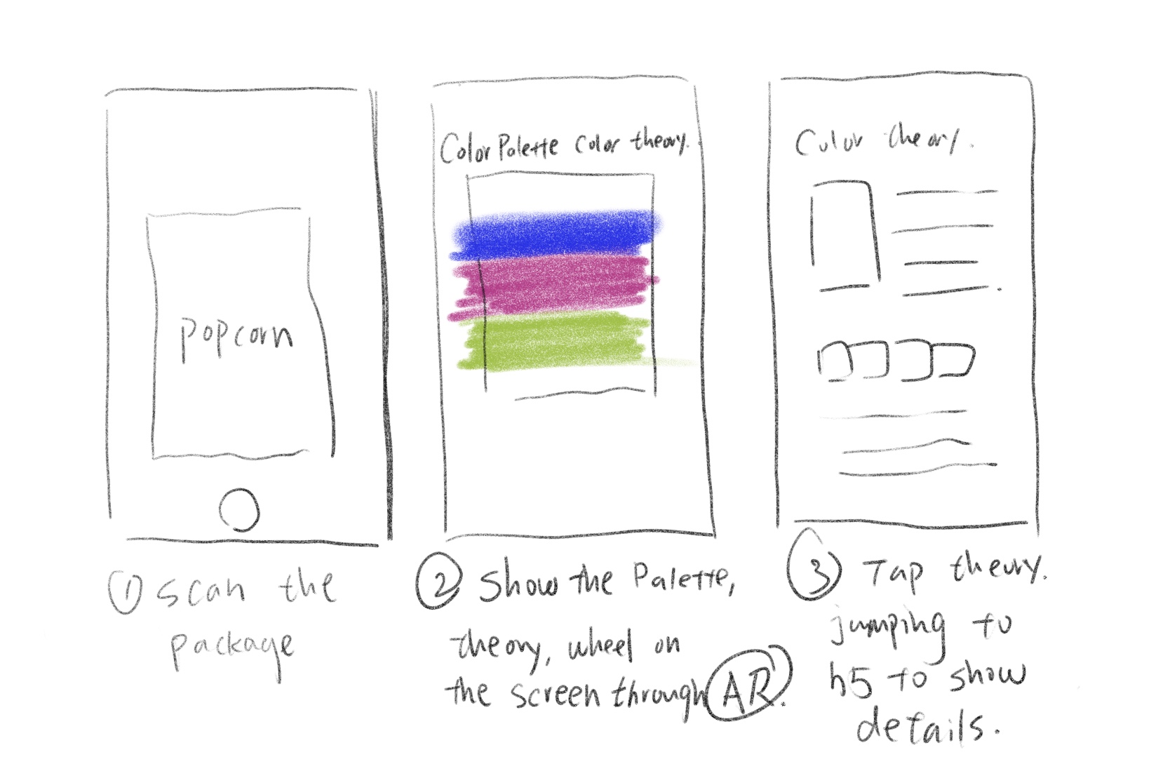
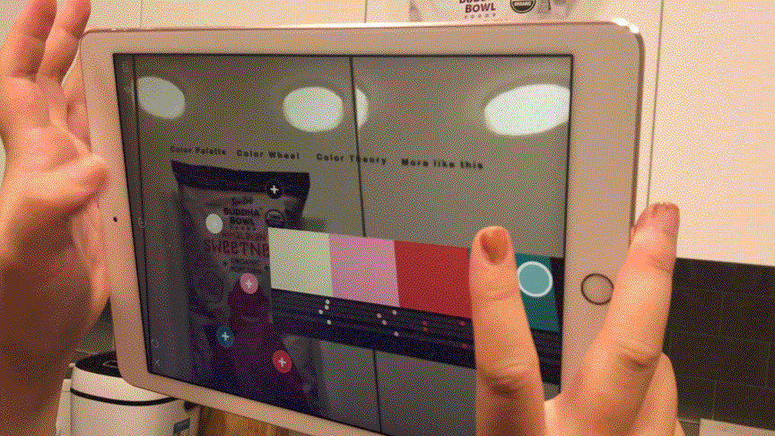
1. Launch the app and scroll down to scan the object
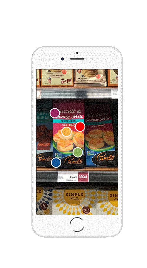
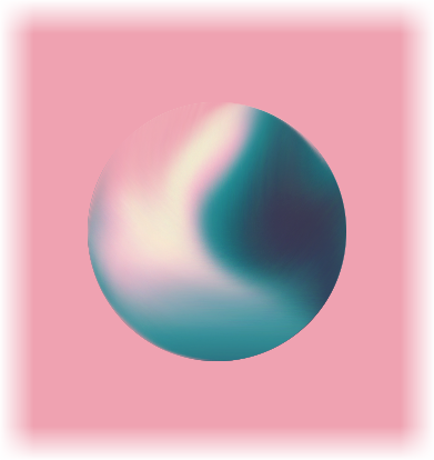
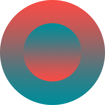
2. Swipe and check out the color palettes, color wheels, patterns and other inspiring looks
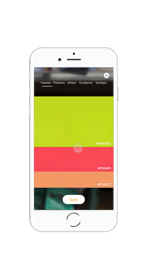
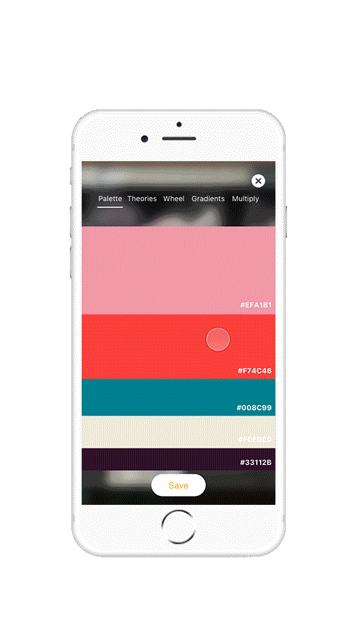
3. Save the palette if you want to collect it
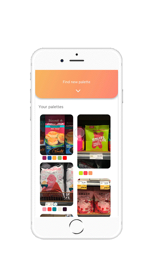
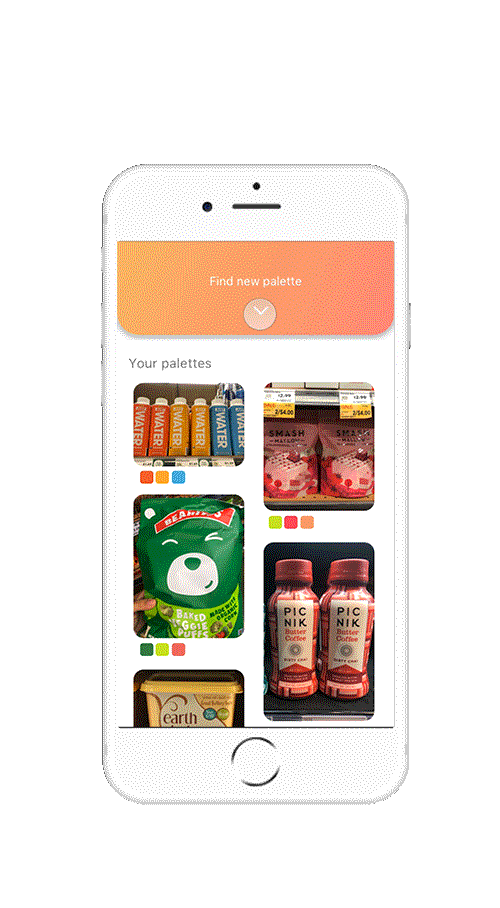
4. Check out the saved palettes when needed
Design Opportunity
Why Color Helper?
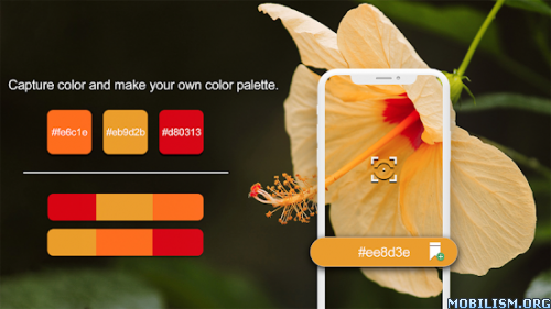
"I have many photos of packages that have beautiful colors."
"Graphic design students are obsessed with compelling colors."
OBSERVATION
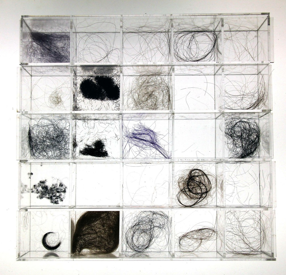
Graphic design students are a group of people who love to save something visually interesting. They not only save on platforms but also collect inspired everyday things by taking photos. What they usually do is to find the one in thousands of photos, and try to learn and explore the possibilities of colors in order to apply to their graphic works.
Interview and takeaways
I talked with 3 graphic design students at CCA to better understand, here are findings:
- They collect colors as backup inspirations and apply to homework
- They explore the possibilities of colors randomly when doing homework, and it takes long hours
- So many photos in the album, mixing with other daily photos, it is frustrated to search
 Question: What do graphic students do and what tools do they have?
What students do are graphic experiments, they express what they want to say and create feelings in their works, which are not commercial at all.
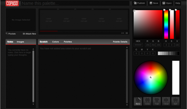
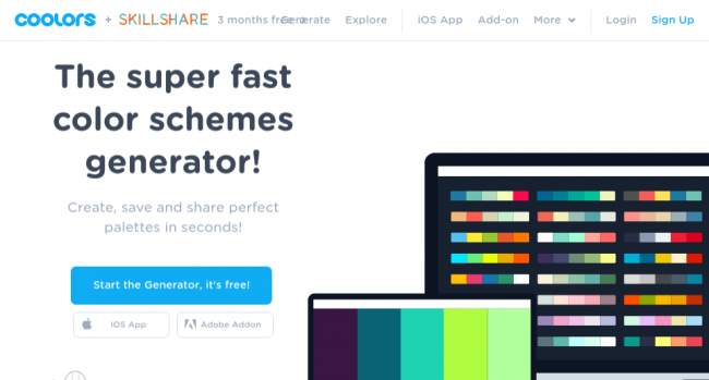
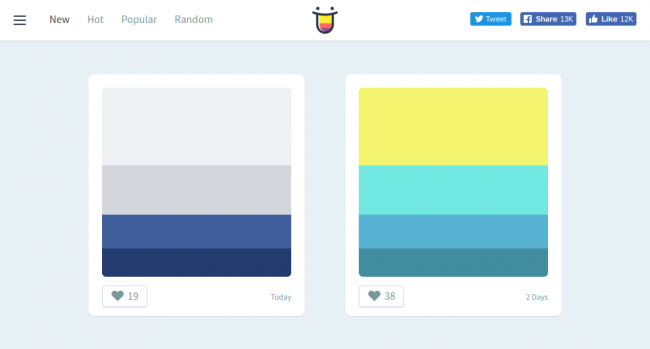
The color tools that exist now are focusing on color detection and color schemes as palette generators. When users click generate, some random schemes show up, which can be adjusted by formula and value. How do those tools work? Students like the palettes, which are good organizers, but they can not give inspiration.
The gap between what people need and what people have is the opportunity, which is:
How to help CCA graphic design students collect the color palettes in everyday life and get them inspired?
Ideations
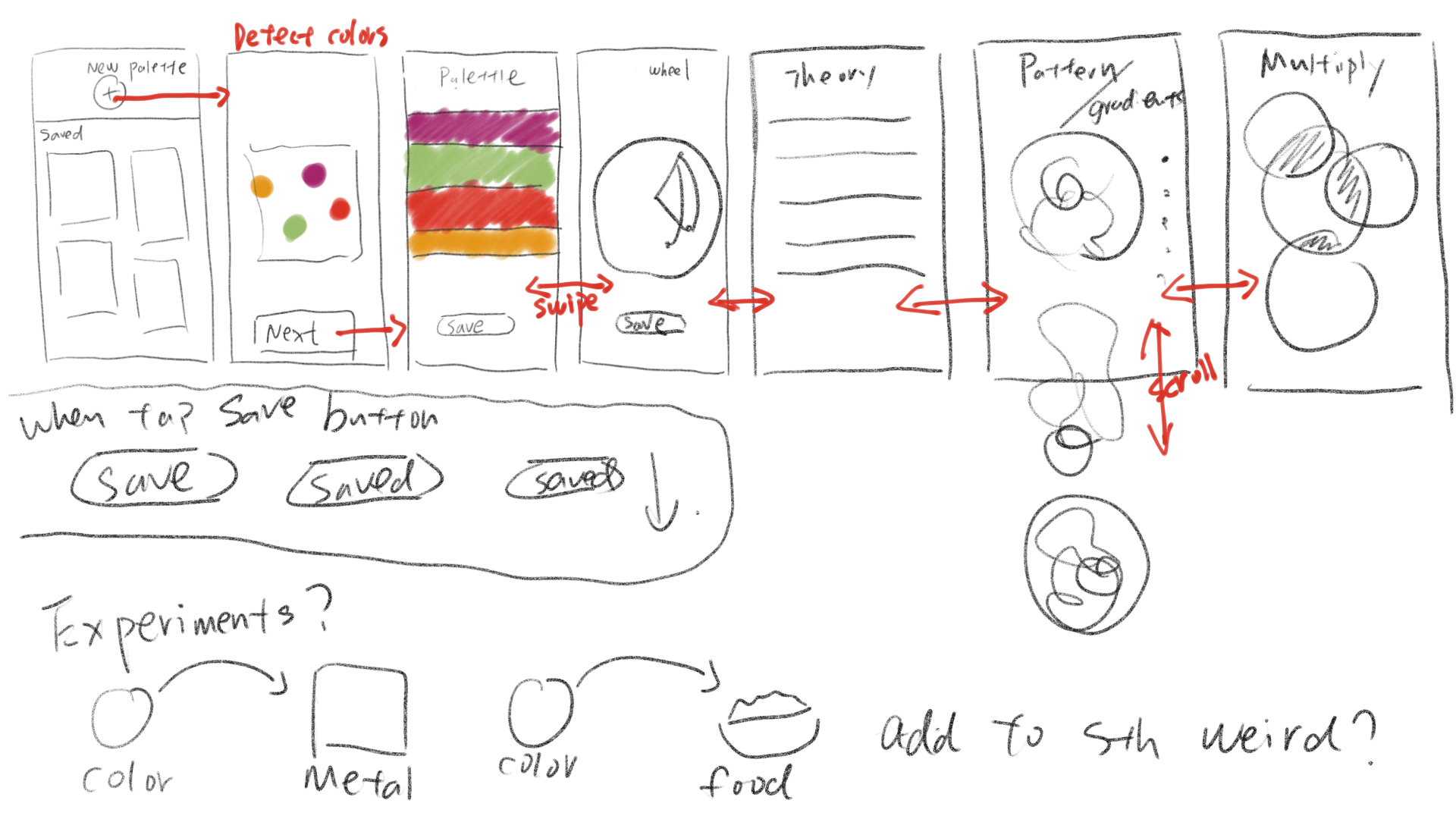
How to play?
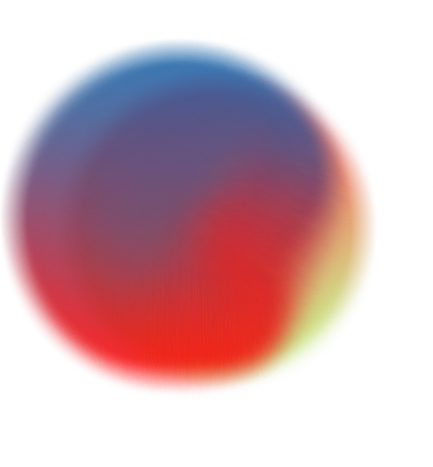
Basically, the idea is that people are able to scan the objects and the phone detects the main colors. And then, it shows some inspiring stuff on the screen, the color palette, color wheel, color theory, and related palettes show on the screen by AR. People can tap the menu to shift between them.
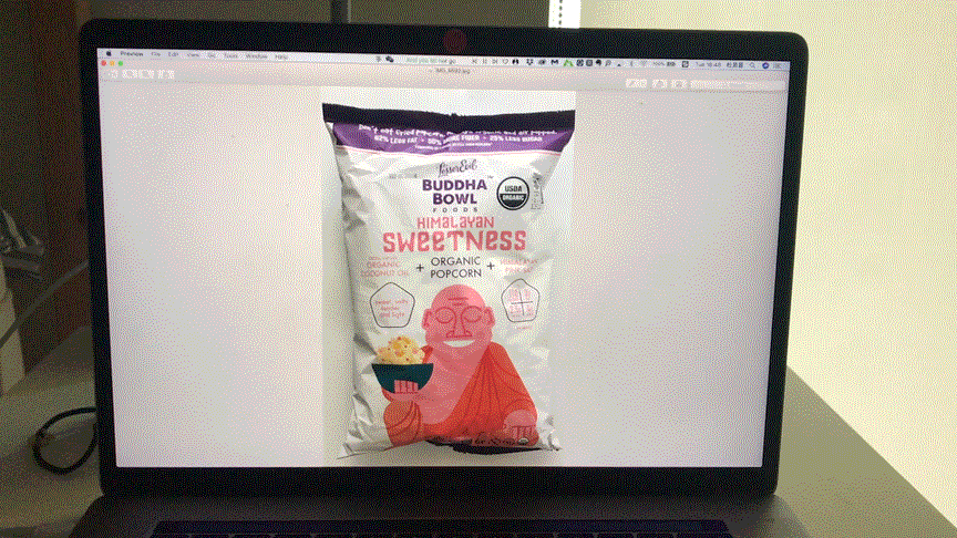
Then, I made a high-enough-fidelity prototype for user testing.
Key findings
- AR is really cool, but it's hard to read sometimes
- The details of color palette look messy
- Theory works. It's helpful, but not inspired
Iteration
To improve the experience, I changed it into screen-based. And based on the feedback from the professor, I added patterns, gradients and multiply effects. And I also added color experiments.
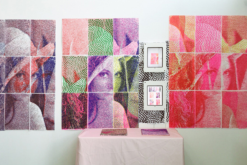
I chose 3 objects in the supermarket as samples, picked the color palettes and played around to create patterns.


I also made a wireframe to put the idea in a structural system.
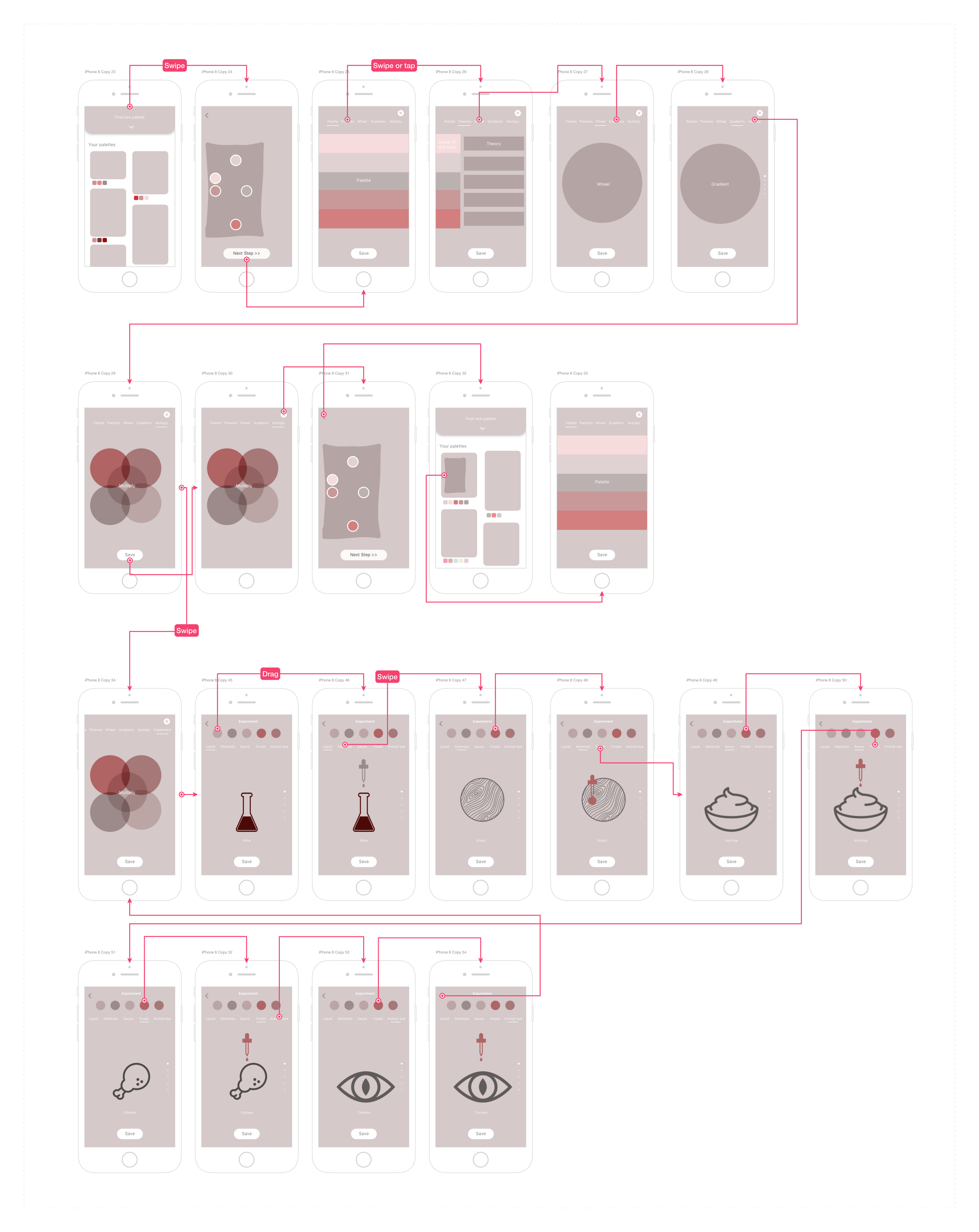
High-Fidelity Prototype